
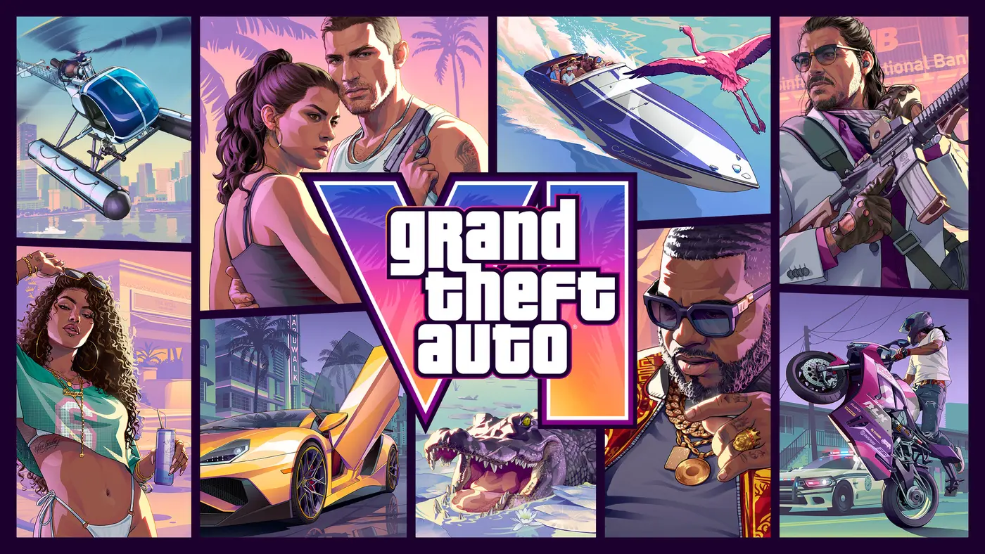
By revealing the official cover art for Grand Theft Auto VI, Rockstar did more than drop a pretty image to download. The studio packed the visual manifesto of the most anticipated game in history into a single frame. Every vignette is a clue, every color a deliberate choice. We went over the artwork with a fine-tooth comb, piece by piece.
The Vignette Collage, Rockstar’s Signature Since 2001
Before you even look at who is hiding in the image, you have to recognize the grammar. This mosaic cover, where fragments of action assemble around a big central logo, is the series’ graphic DNA going back to GTA III in 2001. The studio refined it generation after generation, turning it into an absolute icon with the GTA 5 cover in 2013, its nine panels and Chop the dog.
By bringing this format back, Rockstar sends a signal of continuity. Where many publishers now bet on a single character in close-up, GTA stays faithful to the patchwork that says, at a glance, that you are stepping into a teeming world rather than a linear story. The promise is plain: this is not the portrait of a hero, it is the portrait of a city.
At the Center, Jason and Lucia: The Series’ First Duo
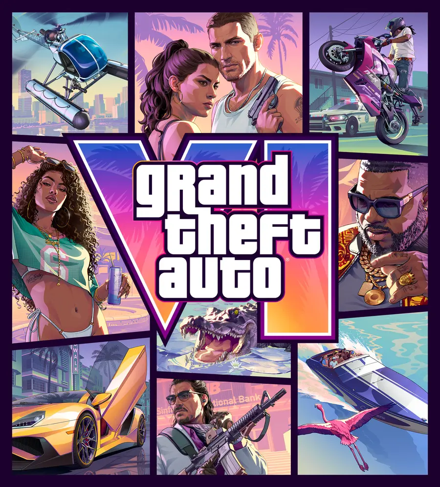
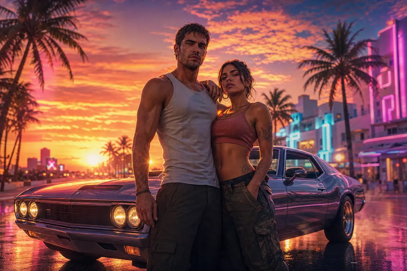
The heart of the image leaves no doubt about the game’s subject. Jason Duval and Lucia Caminos take the center of the composition, the two protagonists you will follow in turn. That is a first: never before had a main GTA cover put a playable duo at the center, let alone a female lead. The series had experimented with multiple characters via the GTA 5 trio, but here the couple is front-facing, tight-knit, presented as argument number one.
Their stance already says a lot. Partners in crime and a touch defiant, they embody the Bonnie and Clyde duo Rockstar has been pushing since the very first trailer. If you want to dig into what makes this tandem original, we laid it all out in our piece on Jason and Lucia, the series’ first playable duo.
Around Them, All of Leonida in Vignettes
It is in the margins that the cover becomes a playground for the eye. Each fragment plants a slice of the world.
- Boobie Ike, shades on and gold chains out, gets a prime vignette. This Leonida mogul, already seen in Trailer 2, stands for easy money and local power. His presence confirms his status as a front-line supporting character.
- A yellow supercar at full tilt is a reminder that driving stays the heart of the game, and that Leonida is lived with the pedal to the floor.
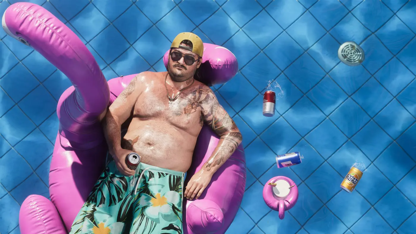
- A speedboat and its inflatable pink flamingo sum up the seaside, slightly kitsch spirit of the coast, between upscale marinas and parties on the water.
- A swamp alligator is a reminder that behind the neon, the Florida-inspired state hides wild Everglades and their wildlife.
- A biker mid-wheelie and a robber outside a bank inject the expected dose of adrenaline and crime, the heist staying a pillar of the formula.
For anyone who wants to put a name to every face, we keep an up-to-date roster of Leonida’s supporting characters, growing richer as Rockstar unveils its world.
The VI Logo and the Neon Palette: The Vice City DNA
Everything converges on the big purple “VI” logo, in Roman numerals, anchoring the composition at the center. The lettering carries over the gold-and-neon typography of the series, already seen on the first visuals, and the choice of purple is no accident: it is the campaign’s signature color since the first tease, the one coloring the logos, the posters and even the trailers.
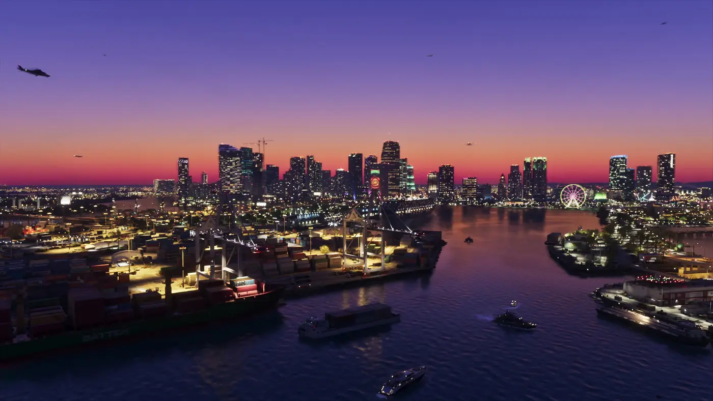
Around it, the pastel neon palette does all the mood work. Hot pinks, sunset oranges, pool-and-bay turquoises: Rockstar paints a modern Vice City bathed in Florida’s warm light, halfway between a postcard and a fever dream. We had already dissected this art direction in our Trailer 2 breakdown, and the cover condenses it into a single image.
What the Cover Says, and Does Not Say, About the Game
A finished cover put up for download is never a calendar footnote: it is the marketing shifting into high gear. The artwork is locked, ready to dress the physical boxes and the storefront pages when pre-orders open on June 25. You can read the essence of the pitch in it: two heroes, a city as the stage, crime and sunshine.
What remains is what the image leaves unsaid. No map, no printed date, not the faintest hint of a price or a collector’s edition. Rockstar is keeping those cards for the moment you hit “pre-order.” The cover does what a great cover should: make you want it without telling you everything. And on that front, the studio is still the master.
Comments
Be the first to react.